Winter Suhaag Show 2010
Toronto Congress Centre
February 07, 2010
This year was the first year we went with deep colors for the show. We weren’t sure if we should set up a booth with clean lines and soft colours as always or do something with a lot of bright colors. I feel doing dark colors can sometimes compete with your outfit and the wedding party. But with purple being a hot color this year for outfits and brides maids, doing colors dark or lighter than deep purple would be a great idea . For the Winter 2010 show, our color palette was Aqua, Red and Gold. All three colors would look amazing with Purple when used properly. Having too many colors in your backdrop will bring more attention to the backdrop and not the Bride and Groom. Take a look at the pictures from the show.

Aqua Glitter Fabric with gold shimmer Taffeta fabric, Gold Satin, Red and Aqua Crystals, Rain drop Candles and mini chandeliers
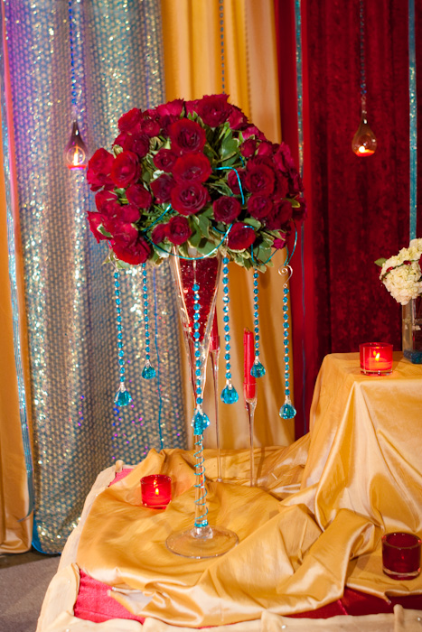

Sqaure Martin Glass with red sweet heart roses and aqua crystals
Tall Vase with aqua and red feathers with red sand
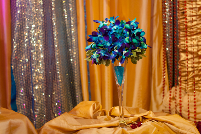
Vase with Aqua orchid kissing ball
Vase with one stem of White Cymbidium Orchid and Red sand
Vase with red princess ball and Aqua crystals inside the vase
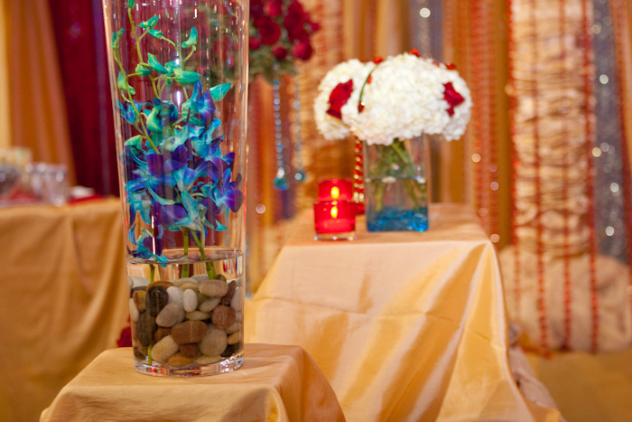
Vase with Aqua Orchids with stones
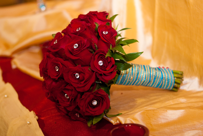
Freedom Red roses with clear crystals and Aqua ribbon
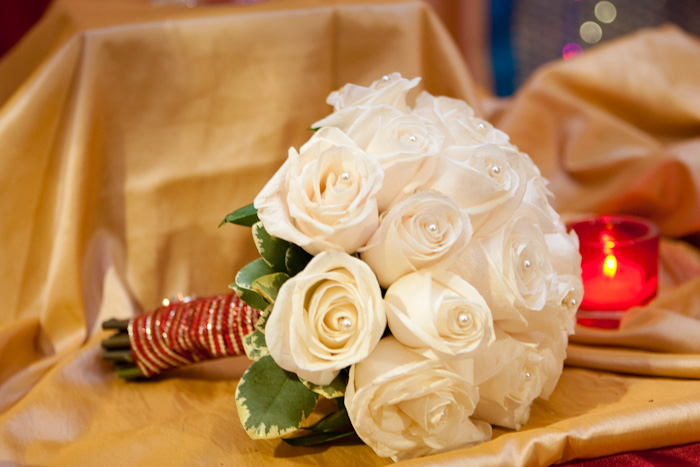
Bouquet with beautiful cream Roses and Red ribbon with Gold embellishments
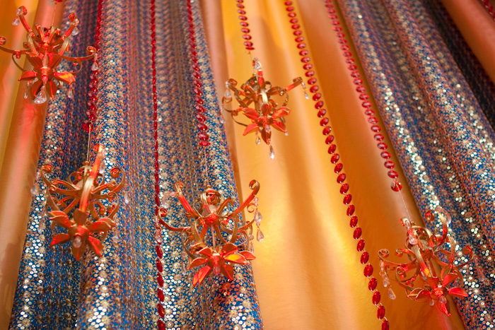
Accessories: Mini Gold Chandeliers and Red Crystals
Booths Decorated at the Suhaag Show:
Jamayz – Custom bridal,South Asian evening and party wear, Unique Designs in Mississauga.
Sherbano- Trendy clothing
We used basic soft White shears for their booth to ensure that the clothing was the focal point, allowing the designs to shine and not the decor. The booth looked amazing with the simplistic layout of the mannequins and the lightness of booth decor. This drew clients in to stop and have a look and will leave a lasting impression.
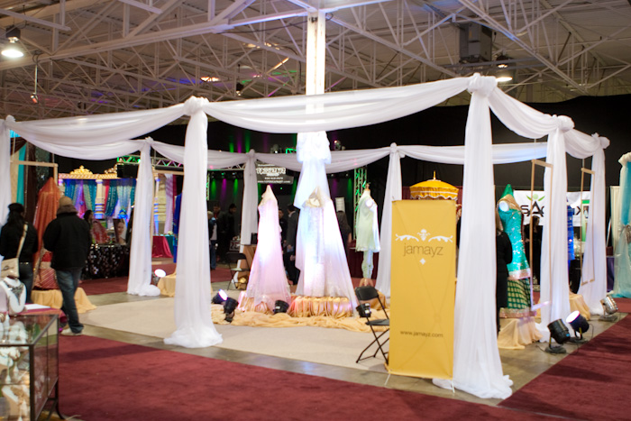
Ethnic Empire- Men’s Formal Wear
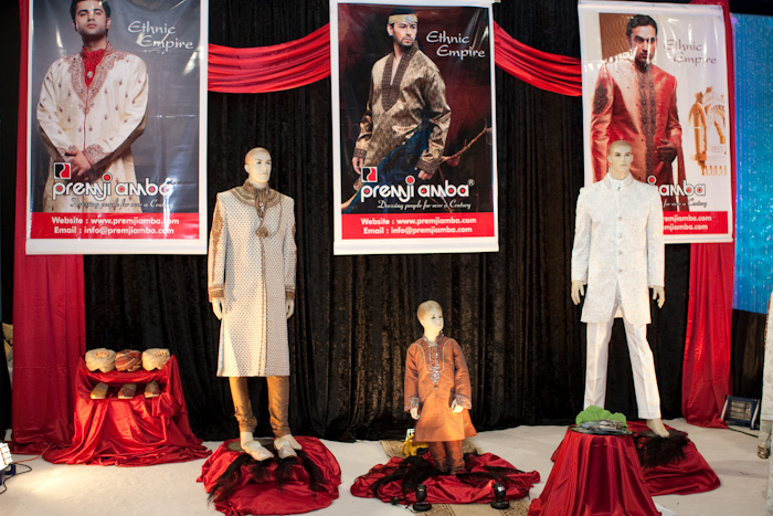
We used Black and Red to create a striking booth design for Ethnic Empire – Men’s Formal Wear. The colours worked well for two reasons, one they carry the company’s colours through helping to brand the booth and second it creates a backdrop which allows the clothing to standout. If we added more Red and a little less Black the outfits would have blended into the background. The Red touches of fabric at the base of the mannequin is just the prefect amount of Red to create the desired effect.
We would love to hear your feedback on colors for 2010.


